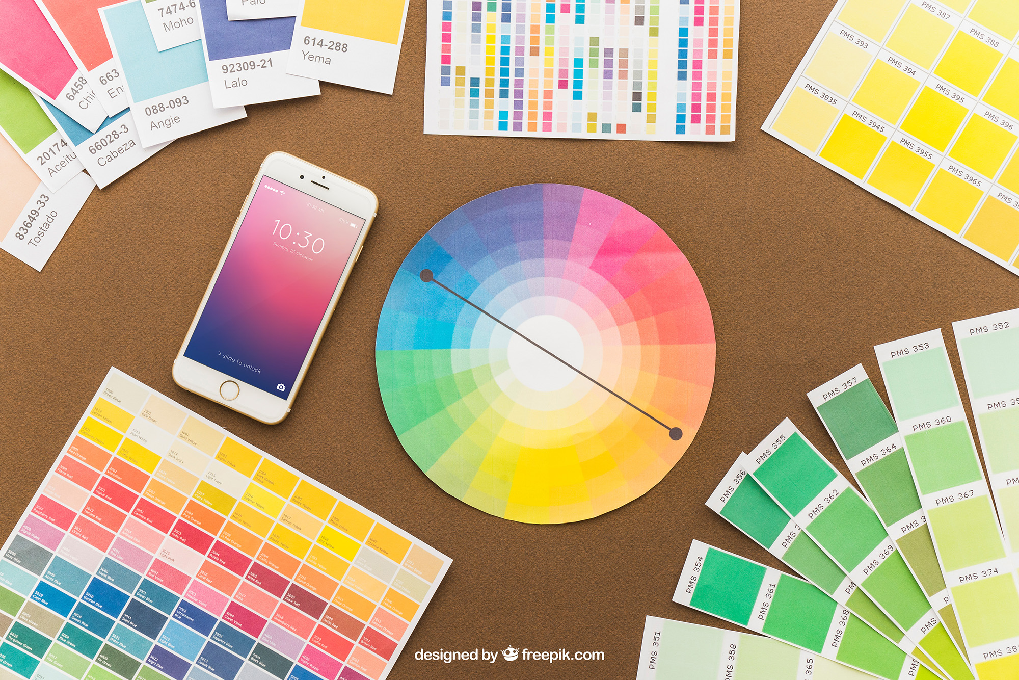
Visual brand identity is the cohesive look and feel of all the visual elements associated with a brand—ranging from color schemes to typography, and from logos to the style of imagery used. When expertly executed, these elements not only make your brand instantly recognizable but also convey its personality and values.
Consider some of the world’s most renowned brands, like Apple or Nike. With just a glimpse of their logos or a specific color combination, consumers can immediately identify them. Not only that, these visual cues often invoke a set of feelings or attitudes toward the brand, be it a sense of innovation, luxury, or reliability.
The objective of this article is to provide a comprehensive guide for creating a visual brand identity that not only resonates but is also memorable. We’ll dive into why consistency matters, explore the psychology behind colors and fonts, and learn about the role of various brand assets.
Before we delve into the nitty-gritty details of each component, it’s vital to understand that your visual brand identity is not an isolated entity. It should be part of a broader branding strategy, encompassing your mission, values, and target audience. Think of it as the visual language that communicates who you are as a brand; a language that should be meticulously designed, fluent, and easy for your audience to understand.
Whether you are an established business considering a rebrand or a startup in the earliest stages of brand creation, this guide will offer invaluable insights. We’ll walk you through the steps of crafting a visual identity that not only captures attention but also fosters trust and long-term loyalty.
Now that you have an overview of what to expect and why this topic is vital, let’s dive deeper into the elements that constitute a robust visual brand identity.


