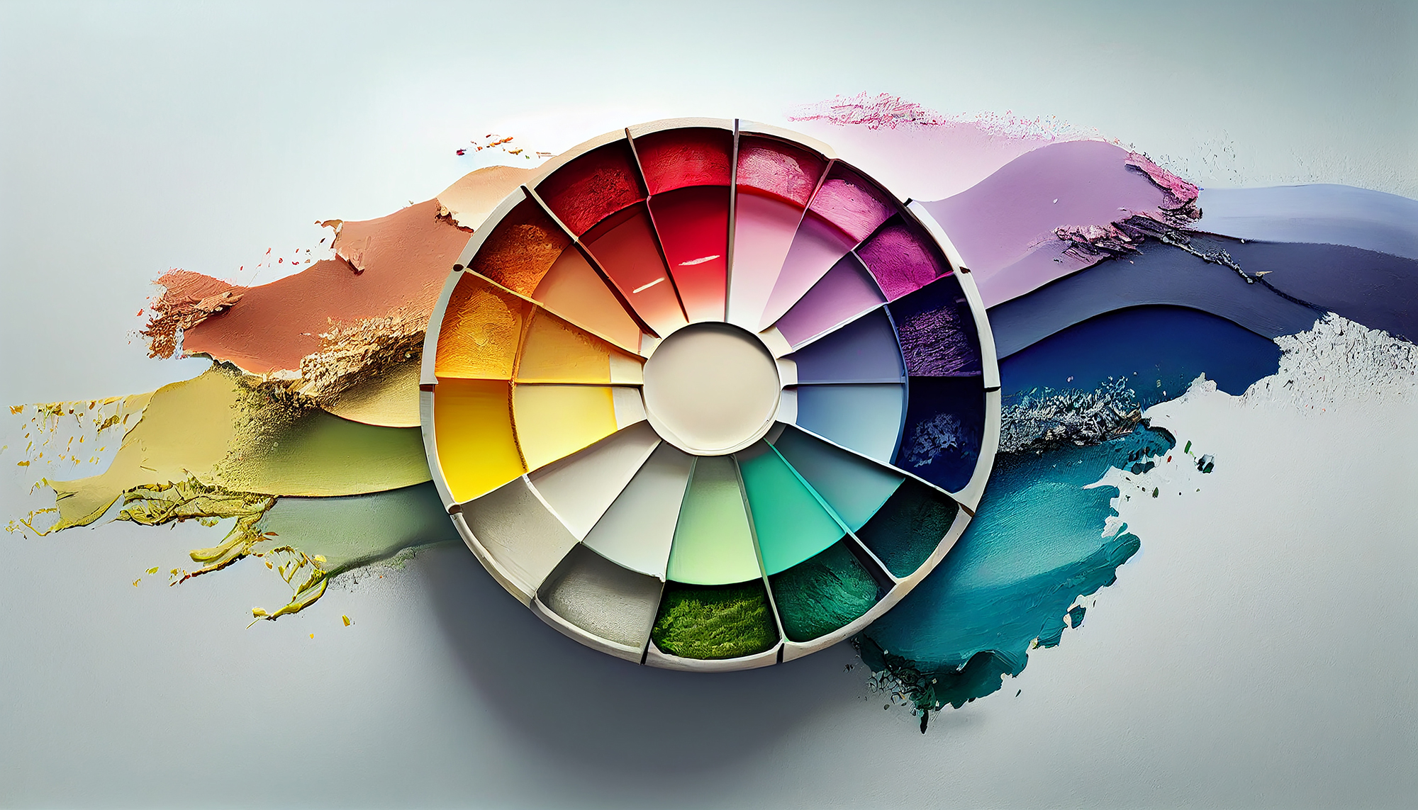
What is Colour Theory?
Colour theory is a multifaceted subject that delves into the science, art, and psychology of how colours interact and are perceived. In essence, it serves as a guide to help us understand and utilise colour to create harmony, balance, and visual impact in a design. Colour theory isn’t just about choosing pretty shades; it’s a robust framework that designers use to communicate, evoke emotions, and even influence decisions.
The Importance of Colour in Graphic Design
Graphic design is a visual medium, and colour is one of its most powerful tools. From branding to web design, the colours you choose can make or break the message you’re trying to convey. Here are some reasons why mastering colour theory is essential in graphic design:
Builds a Strong Brand Identity
Colours have the power to create a unique and memorable brand identity. Think of the iconic golden arches of McDonald’s or the simple yet striking red and white of Coca-Cola. These colours aren’t chosen at random; they’re carefully selected to embody the brand’s essence and message.
Enhances User Experience
Good colour combinations don’t just look appealing; they enhance readability and user interaction. In web design, for instance, contrasting colours can make text more readable, while complementary colours can guide the viewer’s eye to important elements, such as a call-to-action button.
Emotional and Psychological Impact
Colours can evoke emotions and set the mood for your design. For example, blues can evoke feelings of trust and tranquillity, while reds can stimulate and excite. Understanding the emotional impact of colours can help you make more informed design decisions.
Increases Accessibility
Using contrasting colours effectively can make your designs more accessible to viewers with visual impairments. This inclusivity ensures that your message reaches a broader audience.
The Risk of Ignoring Colour Theory
Neglecting colour theory can result in designs that are either visually jarring or ineffective in communicating their intended message. Poor colour choices can confuse the audience, make text hard to read, or even convey the wrong emotion or message.
Conclusion
Mastering colour theory is not an overnight process, but it’s an essential skill for anyone in the field of graphic design. By understanding the basics of colour interaction, the emotional weight of different hues, and the principles of creating harmonious colour schemes, you equip yourself with a powerful tool for effective visual communication.


