Introduction
In today’s fast-paced digital world, engaging readers isn’t just about the text; it’s about the entire presentation. This chapter will delve into how strategic use of visuals and thoughtful formatting can enhance the user experience and contribute to SEO efforts, making your article stand out on Google News.
The Importance of Visual Elements
Visuals break up large blocks of text, add aesthetic appeal, and can help explain complex ideas. They engage readers and often lead to higher sharing and engagement rates.
Tip: Use visuals to highlight key points of your article, illustrate examples, or clarify complex concepts.
Selecting High-Quality and Relevant Images
Images should complement and enhance your content, not just fill space. They should be original or legally sourced and appropriately attributed.
Example: For a travel article, use a stunning original photograph of a location you are describing, rather than a generic stock photo.
Optimizing Images for Web Performance
Avoid slow page loads by using the right file formats and compressing images without significant loss of quality. Always add alt text for accessibility and SEO.
Tool to consider: Use TinyPNG or ImageOptim to compress images without losing quality.
Integrating Infographics and Videos
Infographics can condense a lot of data into an easy-to-understand format. Videos can provide in-depth explanations or demonstrations.
Example: In a cooking blog, a video demonstrating a cooking technique can be more effective than text alone.
Crafting Scannable and Readable Layouts
Internet users often scan articles quickly. Make your content easy to skim by using short paragraphs, bullet points, and subheadings. Use white space effectively to avoid overwhelming readers.
Tip: Aim for a Flesch Reading Ease score above 60 for general audiences.
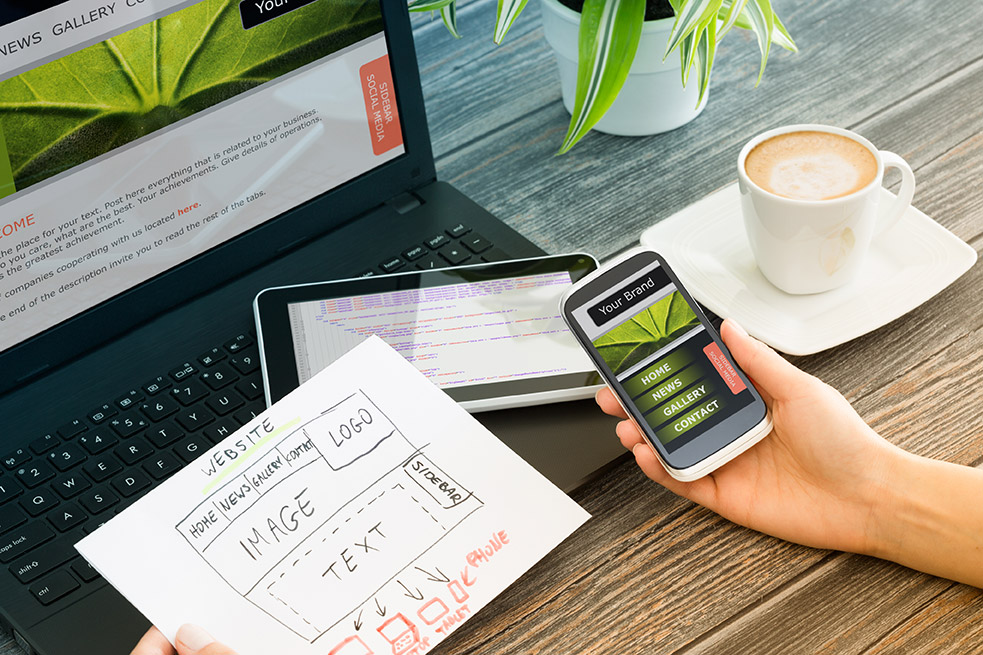
Responsive Design for Multi-Device Compatibility
Your content must be readable and visually appealing on desktops, tablets, and smartphones. Test your content’s appearance on various devices to ensure it is responsive.
Tool to consider: Use Google’s Mobile-Friendly Test or BrowserStack to check your site’s responsiveness.
Guiding the Reader with Effective CTAs (Calls to Action)
CTAs guide readers on what to do next. Whether that’s reading another article, signing up for a newsletter, or purchasing a product, your CTA should be clear, concise, and compelling.
Example: A well-placed CTA at the end of an article with the text “Discover more travel tips – Sign up for our weekly newsletter!”
Conclusion
Enhancing user experience with visuals and formatting is not just about aesthetics; it’s a strategic approach to keep your readers engaged and encourage them to interact further with your content. A visually appealing, well-organized article is more likely to be read, shared, and ranked favorably by search engines, including Google News.
Additional Resources
- Canva: A user-friendly tool for creating professional-quality visuals
- Google’s Mobile-Friendly Test Tool
- Grammarly or Hemingway Editor: Tools for refining content readability


