The Psychology of Visual Design
Before delving into the specific design elements, it’s essential to understand that visual design isn’t just about making things “look good.” There’s a psychology behind how people perceive and react to visual stimuli. Elements like color, layout, and imagery can evoke specific emotions, leading visitors down the path to conversion. Therefore, a well-thought-out design strategy can significantly influence user behavior.
Imagery that Resonates
Images can convey complex messages in an instant, often more effectively than words. However, not just any image will do:
- Relevance: The imagery should align with your brand and the message you’re conveying.
- Quality: High-resolution, professionally shot or designed images can make a huge difference in how your brand is perceived.
- Emotion: Opt for images that evoke the kind of emotions you want to associate with your product or service.
Symmetry and Balance
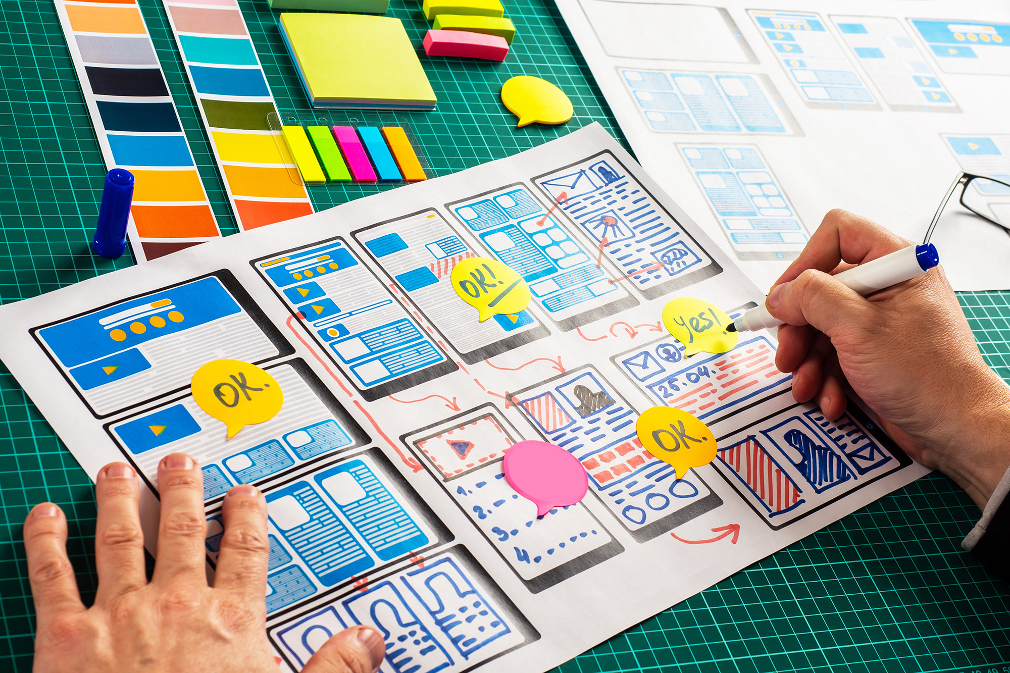
A balanced landing page creates a sense of harmony, making it easier for visitors to navigate and absorb the content. Symmetry doesn’t necessarily mean everything has to be perfectly mirrored; rather, it’s about distributing elements in a way that feels balanced to the viewer.
Responsive Design
Today’s internet users are as likely to browse on a mobile device as they are on a desktop. Your landing page should adapt to different screen sizes without losing functionality or aesthetic appeal. Responsive design ensures that text, images, and other elements re-adjust to fit the screen, offering a consistent user experience across devices.
Microinteractions
These are small, subtle animations or design elements that guide the user or provide feedback. For example, a button might change color when hovered over or clicked. Microinteractions enhance user engagement without being distracting.
Visual Hierarchy
In visual design, hierarchy helps you present information in a way that reflects its importance. The most crucial elements should be the most eye-catching, usually through size, color, or position on the page. This guides the visitor’s attention to the places you most want it to go—usually ending at your call to action.
Conclusion
A well-designed, aesthetically pleasing landing page can significantly improve your conversion rates. By focusing on the psychology behind visual design, utilizing impactful imagery, and employing principles like symmetry, balance, and visual hierarchy, you can create a landing page that not only captures attention but also encourages action.

