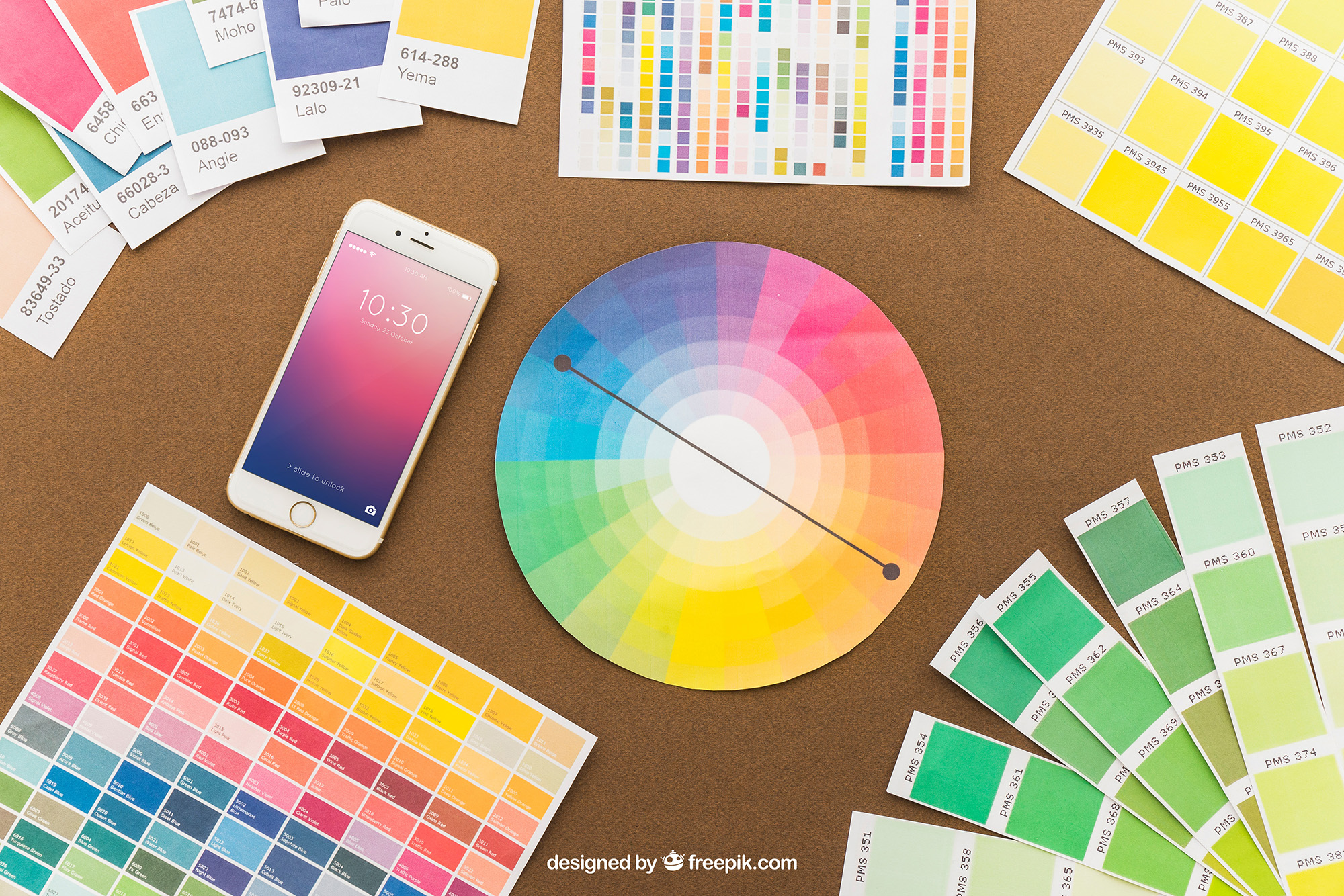
Introduction to Colour Harmonies
Colour harmonies are specific arrangements of colours that create a pleasing or logical relationship when used together. By understanding and applying these harmonies, graphic designers can create visually appealing and impactful designs. Let’s dive into some common types of colour harmonies and how to use them effectively.
Types of Colour Harmonies
Monochromatic Harmony
A monochromatic colour scheme uses variations in lightness and saturation of a single colour. This approach offers a clean and elegant look but can lack dynamism if not handled well.
How to Use:
Start with a base colour and adjust its lightness and saturation to get a range of shades and tints.
Analogous Harmony
As mentioned in the previous chapter, analogous colours sit adjacent to each other on the colour wheel. This scheme creates a harmonious and cohesive look but may lack contrast.
How to Use:
Pick colours that are next to each other on the colour wheel and ensure you have enough contrast by playing with the value and saturation.
Complementary Harmony
Complementary colours are opposite each other on the colour wheel. When used together, they create a vibrant and high-contrast look.
How to Use:
Balance is key. Use one colour as the dominant hue and the other for accents. Too much contrast can be jarring, so use complementary colours sparingly.
Split-Complementary Harmony
In a split-complementary scheme, one base colour is paired with two adjacent colours to its complementary. This scheme offers high contrast without the tension of the standard complementary scheme.
How to Use:
Choose a dominant colour and use the two adjacent colours for accents and highlights.
Triadic Harmony
Triadic colours are evenly spaced around the colour wheel. This scheme is balanced and harmonious but requires careful planning.
How to Use:
Pick three colours that are evenly spaced on the colour wheel. Use them in varying proportions to create balance.
Tips for Effective Use of Colour Harmonies
- Test Your Choices: Always preview your colour choices in the design layout. What looks good in theory may not work in practice.
- Consider Readability: Make sure text is easy to read against background colours.
- Check for Accessibility: Use online tools to ensure your colour choices are accessible to people with colour vision deficiencies.
- Mind Cultural Context: Remember that colour perception can vary based on cultural context. What may be seen as a positive colour in one culture may have a negative connotation in another.
Conclusion
Colour harmonies are more than just pleasing combinations; they can help convey your message effectively and elicit specific responses from your audience. By understanding and applying these principles, you can enhance your designs and communicate more powerfully.


