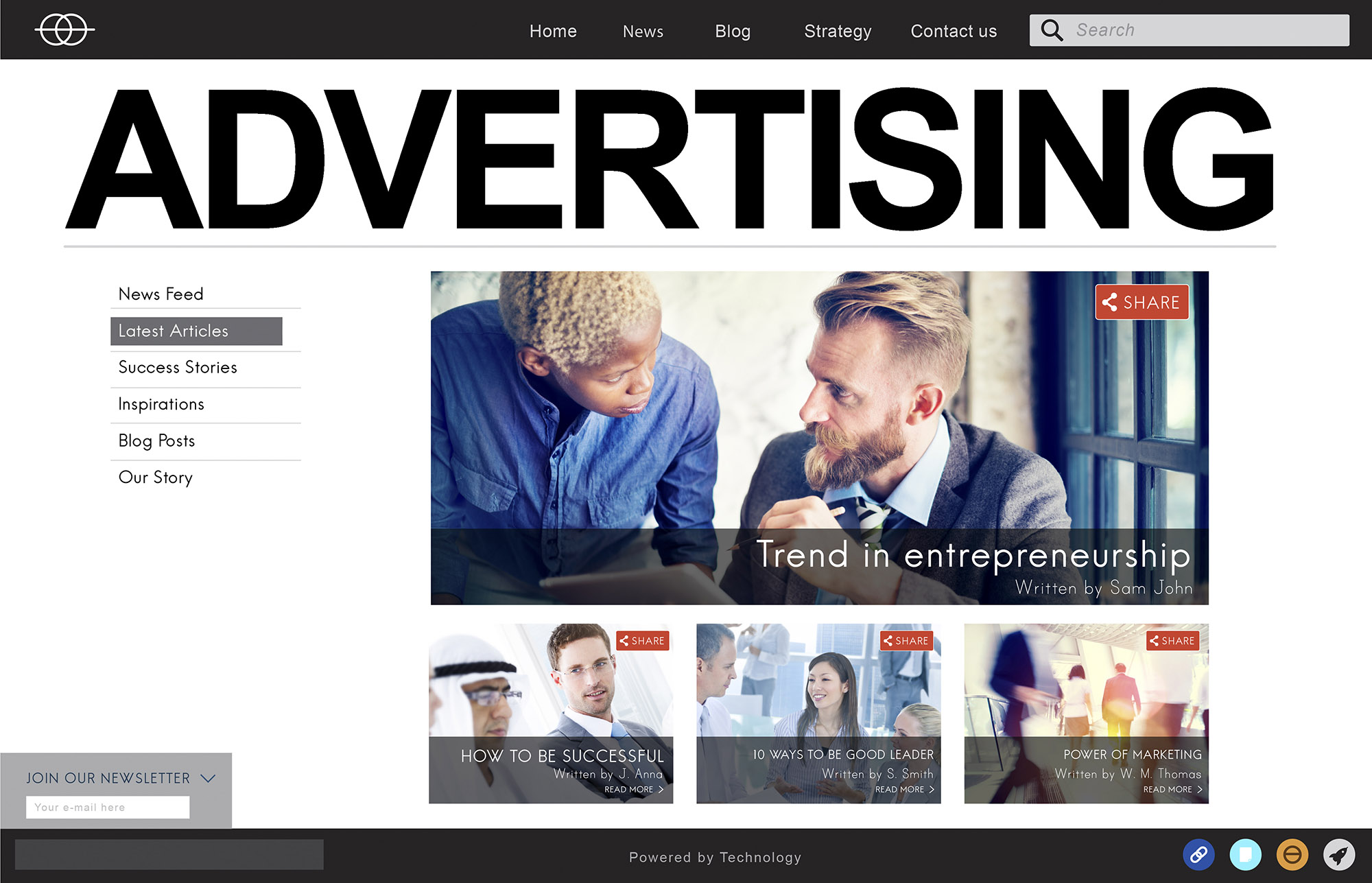
First Impressions Matter
It takes just a few seconds for a visitor to form an impression of your website. A clean, organized layout with intuitive navigation can create a positive experience that invites further exploration. On the other hand, a cluttered or outdated design could send potential customers fleeing before they even have a chance to understand what you offer.
The Role of Typography and Colors
The choices of fonts, colors, and text layouts may seem like minor details, but they can greatly impact readability and user experience. For instance, a font that’s too small or too ornate can make reading difficult, thereby discouraging visitors from engaging with your content. Similarly, the use of colors can evoke different emotions and either complement or clash with your brand’s message.
Responsive Design: Catering to All Devices
With a growing number of users accessing websites via mobile devices, a responsive design that adapts to different screen sizes is no longer optional; it’s a necessity. A site that’s hard to navigate on a smartphone will almost certainly lose visitors, diminishing your chances of retention.
User-Centric Design
A user-centric design focuses on the needs and wants of the user. This approach involves creating a logical flow of information, placing important items where they are easily found, and minimizing the number of clicks it takes to reach a destination page. It’s all about making the experience as seamless as possible for your visitors.
Speed and Load Time
A slow-loading website is a surefire way to increase your bounce rate. Even a one-second delay in load time can result in significant losses in conversions. Compressing images, optimizing code, and leveraging browser caching are just a few methods to speed up your website.
Calls to Action
Effective calls to action (CTAs) can guide your users to take desired actions, whether it’s signing up for a newsletter or making a purchase. CTAs should be strategically placed, easy to find, and compelling enough to convince your visitors to take the next step.
A/B Testing: The Key to Improvement
Once you’ve implemented web design best practices, the next step is A/B testing. This involves creating two versions of a page—version A and version B—with one varying element to see which performs better in terms of user engagement and retention.
In conclusion, a well-designed website is a critical tool for retaining visitors. It’s not just what your site offers that matters, but also how it’s presented. By adhering to web design best practices, you can create an inviting, user-friendly experience that keeps visitors coming back for more.


