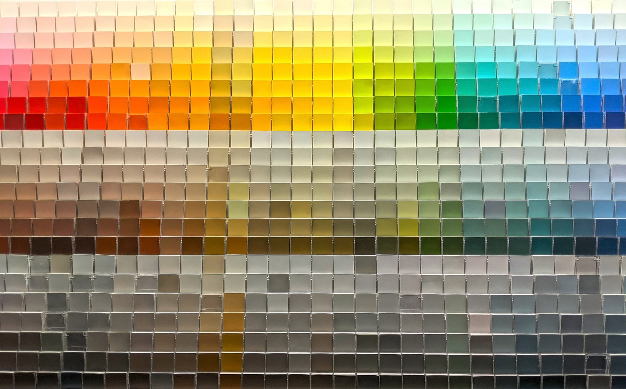
Colors are more than just visual elements; they carry psychological weight that can influence our emotions, behaviors, and decision-making processes. When selecting a color scheme for your website, understanding the psychology of color can help you make more effective choices. In this chapter, we will explore how different colors commonly evoke specific emotional responses, and how this knowledge can be applied to website design.
The Basics of Color Psychology
Color psychology is the study of how color affects human behavior and decision-making. It has applications in various fields, including marketing, interior design, and, of course, website design. While individual reactions to color can vary due to cultural, personal, or situational factors, there are general tendencies associated with different colors.
Common Color Associations:
Red
Red is often associated with passion, excitement, and urgency. It can grab attention and is frequently used in sales and clearance signs to create a sense of immediacy.
Blue
Blue exudes calmness, trustworthiness, and reliability. It is often used by tech companies and financial institutions to inspire confidence and security.
Yellow
Yellow signifies happiness, optimism, and cheerfulness but can also signify caution. It is effective for grabbing attention but should be used sparingly to avoid overwhelming users.
Green
Green is most commonly linked with nature, health, and tranquility. It is also associated with growth, wealth, and stability.
Purple
Purple is often connected to creativity, luxury, and sophistication. It is less commonly used in website design but can set a distinct tone when employed judiciously.
Black and White
Black is commonly used to signify sophistication, elegance, and formality, while white is linked with simplicity, cleanliness, and purity.
Application in Website Design
When choosing a color scheme, consider the emotional impact you want to create and how it aligns with your brand’s message. For example, a website related to meditation or mental health could benefit from shades of blue and green, which evoke feelings of calmness and tranquility.
Consider Complementary Colors
Using complementary colors can create balance and harmony within your design. For example, pairing a strong, vibrant color like red with a more subdued color like gray can create a balanced look.
Be Mindful of Cultural Context
It’s also crucial to consider cultural context when choosing colors. What evokes a certain emotion in one culture may not in another. For international audiences, this is particularly important to keep in mind.
Conclusion
Understanding the psychology of color is a powerful tool when designing a website. By selecting colors that evoke the emotions aligned with your brand and desired user experience, you can create a more effective and engaging website


